How to customize shiny sliderInput
Sometimes, you might get bored by the design of the sliders in Shiny. This input widget uses the Ion.Rangeslider js library. In the advanced section, you can notice that 5 themes are actually available. I really like the flat ui skin. In this tutorial, I will describe a way to choose new themes for your shiny sliders.
Use shinyWidgets
Recently, I added 2 functions to the shinyWidgets package of dreamRs: - chooseSliderSkin to set the global skin of all your sliders. Unfortunately, you cannot have different skin for each slider.
library(shiny)
library(shinyWidgets)

ui <- fluidPage(

  # use the Modern design
  chooseSliderSkin("Modern"),
  sliderInput("obs", "Customized slider1:",
              min = 0, max = 100, value = 50
  ),
  sliderInput("obs2", "Customized slider1:",
              min = 0, max = 100, value = 50
  ),
  sliderInput("obs3", "Customized slider1:",
              min = 0, max = 100, value = 50
  ),
  plotOutput("distPlot")
)

server <- function(input, output) {

  output$distPlot <- renderPlot({
    hist(rnorm(input$obs))
  })
}

shinyApp(ui, server)- setSliderColor to pass a custom color for each slider. The color code can either be HEX code or the name of CSS color to have an overview of all colors.
library(shiny)
library(shinyWidgets)

ui <- fluidPage(

  # only customize the 2 first sliders and the last one
  # the color of the third one is empty
  setSliderColor(c("DeepPink ", "#FF4500", "", "Teal"), c(1, 2, 4)),
  sliderInput("obs", "My pink slider:",
              min = 0, max = 100, value = 50
  ),
  sliderInput("obs2", "My orange slider:",
              min = 0, max = 100, value = 50
  ),
  sliderInput("obs3", "My basic slider:",
              min = 0, max = 100, value = 50
  ),
  sliderInput("obs3", "My teal slider:",
              min = 0, max = 100, value = 50
  ),
  plotOutput("distPlot")
)

server <- function(input, output) {

  output$distPlot <- renderPlot({
    hist(rnorm(input$obs))
  })
}

shinyApp(ui, server)
Hope you will enjoy this customization!
library(shiny)
library(shinyWidgets)
slider_colors <- c("AliceBlue",
"AntiqueWhite",
"Aqua",
"Aquamarine",
"Azure",
"Beige",
"Bisque",
"Black",
"BlanchedAlmond",
"Blue",
"BlueViolet",
"Brown",
"BurlyWood",
"CadetBlue",
"Chartreuse",
"Chocolate",
"Coral",
"CornflowerBlue",
"Cornsilk",
"Crimson",
"Cyan",
"DarkBlue",
"DarkCyan",
"DarkGoldenRod",
"DarkGray",
"DarkGrey",
"DarkGreen",
"DarkKhaki",
"DarkMagenta",
"DarkOliveGreen",
"DarkOrange",
"DarkOrchid",
"DarkRed",
"DarkSalmon",
"DarkSeaGreen",
"DarkSlateBlue",
"DarkSlateGray",
"DarkSlateGrey",
"DarkTurquoise",
"DarkViolet",
"DeepPink",
"DeepSkyBlue",
"DimGray",
"DimGrey",
"DodgerBlue",
"FireBrick",
"FloralWhite",
"ForestGreen",
"Fuchsia",
"Gainsboro",
"GhostWhite",
"Gold",
"GoldenRod",
"Gray",
"Grey",
"Green",
"GreenYellow",
"HoneyDew",
"HotPink",
"IndianRed",
"Indigo",
"Ivory",
"Khaki",
"Lavender",
"LavenderBlush",
"LawnGreen",
"LemonChiffon",
"LightBlue",
"LightCoral",
"LightCyan",
"LightGoldenRodYellow",
"LightGray",
"LightGrey",
"LightGreen",
"LightPink",
"LightSalmon",
"LightSeaGreen",
"LightSkyBlue",
"LightSlateGray",
"LightSlateGrey",
"LightSteelBlue",
"LightYellow",
"Lime",
"LimeGreen",
"Linen",
"Magenta",
"Maroon",
"MediumAquaMarine",
"MediumBlue",
"MediumOrchid",
"MediumPurple",
"MediumSeaGreen",
"MediumSlateBlue",
"MediumSpringGreen",
"MediumTurquoise",
"MediumVioletRed",
"MidnightBlue",
"MintCream",
"MistyRose",
"Moccasin",
"NavajoWhite",
"Navy",
"OldLace",
"Olive",
"OliveDrab",
"Orange",
"OrangeRed",
"Orchid",
"PaleGoldenRod",
"PaleGreen",
"PaleTurquoise",
"PaleVioletRed",
"PapayaWhip",
"PeachPuff",
"Peru",
"Pink",
"Plum",
"PowderBlue",
"Purple",
"RebeccaPurple",
"Red",
"RosyBrown",
"RoyalBlue",
"SaddleBrown",
"Salmon",
"SandyBrown",
"SeaGreen",
"SeaShell",
"Sienna",
"Silver",
"SkyBlue",
"SlateBlue",
"SlateGray",
"SlateGrey",
"Snow",
"SpringGreen",
"SteelBlue",
"Tan",
"Teal",
"Thistle",
"Tomato",
"Turquoise",
"Violet",
"Wheat",
"White",
"WhiteSmoke",
"Yellow",
"YellowGreen")
ui <- fluidPage(
title = "setSliderColor/chooseSliderSkin demo",
titlePanel("Pimp your shiny sliders!"),
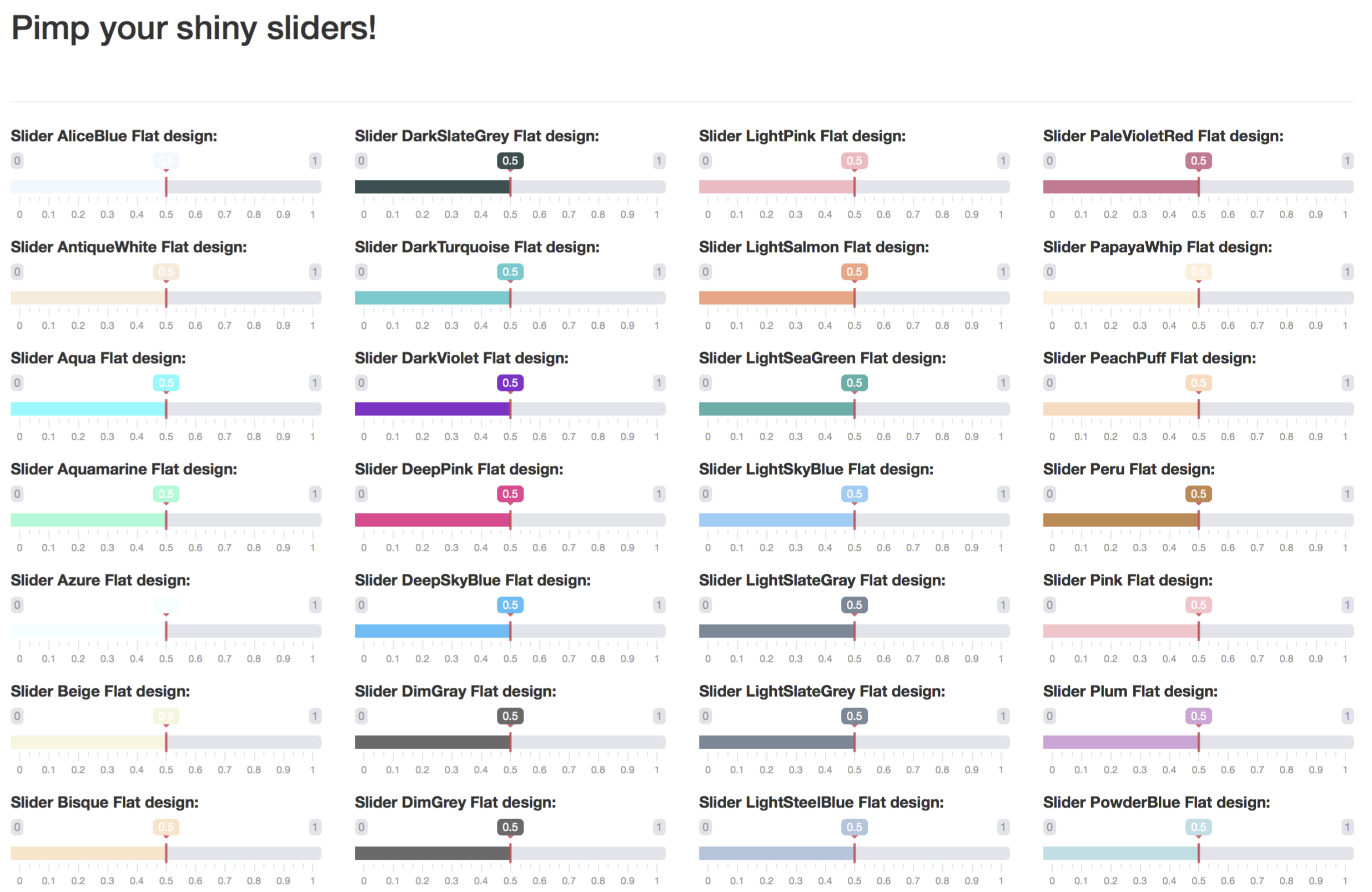
setSliderColor(slider_colors, 1:length(slider_colors)),
chooseSliderSkin("Flat"),
br(), hr(),
# create a set of 148 sliders
# to test the 148 css colors
fluidRow(
lapply(0:3, FUN = function(j) {
column(
width = 3,
lapply((1:37) + 37 * j, FUN = function(i) {
tagList(
sliderInput(
inputId = paste0("slider", i),
label = paste("Slider", slider_colors[i], "Flat design:"),
min = 0, max = 1, value = 0.5
)
)
})
)
})
)
)
server <- function(input, output, session) {
}
shinyApp(ui, server)The code above will give the image below


Add custom slider styles
You might prefer this method in case you would like to add your very own CSS style for sliders. In that case, you will have to re-code the slider-input function from shiny, especially the following part:
dep <- list(
    htmlDependency("ionrangeslider", "2.1.6", c(href="shared/ionrangeslider"),
      script = "js/ion.rangeSlider.min.js",
      # ion.rangeSlider also needs normalize.css, which is already included in
      # Bootstrap.
      stylesheet = c("css/ion.rangeSlider.css",
                     "css/ion.rangeSlider.skinShiny.css")
    ),
    htmlDependency("strftime", "0.9.2", c(href="shared/strftime"),
      script = "strftime-min.js"
    )
  )
You see in this code that the classic skin is choosen, namely skinShiny.css. If you want to add your own dependency with other CSS styles, you have to insert your own dependencies instead.