Essential Shiny packages
I would like to share with you a “best of” of all Shiny packages you might need to build outstanding applications.
Enhance your apps with Javascript
shinyjs
The shinyjs package was designed by Dean Attali, https://deanattali.com/shinyjs/, a very famous shiny user. In summary, it allows you to add interactivity inside your app for example:
- hide/show/toggle widgets, graphs, tables
- reset inputs to their initial value
- enable/disable elements
These are the most noteworthy properties of this package and require just a few lines of code to work. You can, for example, make a header disappear/appear each time the mouse leaves/enters its area. Additionnally, if your app uses a lot of inputs such as sliders, text, giving the opportunity of reseting all inputs independently of each other is crucial.
shinyjqui
shinyjqui, developped by Yang Tang https://cran.r-project.org/web/packages/shinyjqui/vignettes/introduction.html (github), is an amazing package to allow mouse interactions such as dragging/resizing/sorting elements inside your UI. There are also up to 15 animations effects that can be applied to each UI elements (slide, bounce, …). For instance, this might be useful to combine help text with these animations.
Extend shiny input elements
shinyWidgets
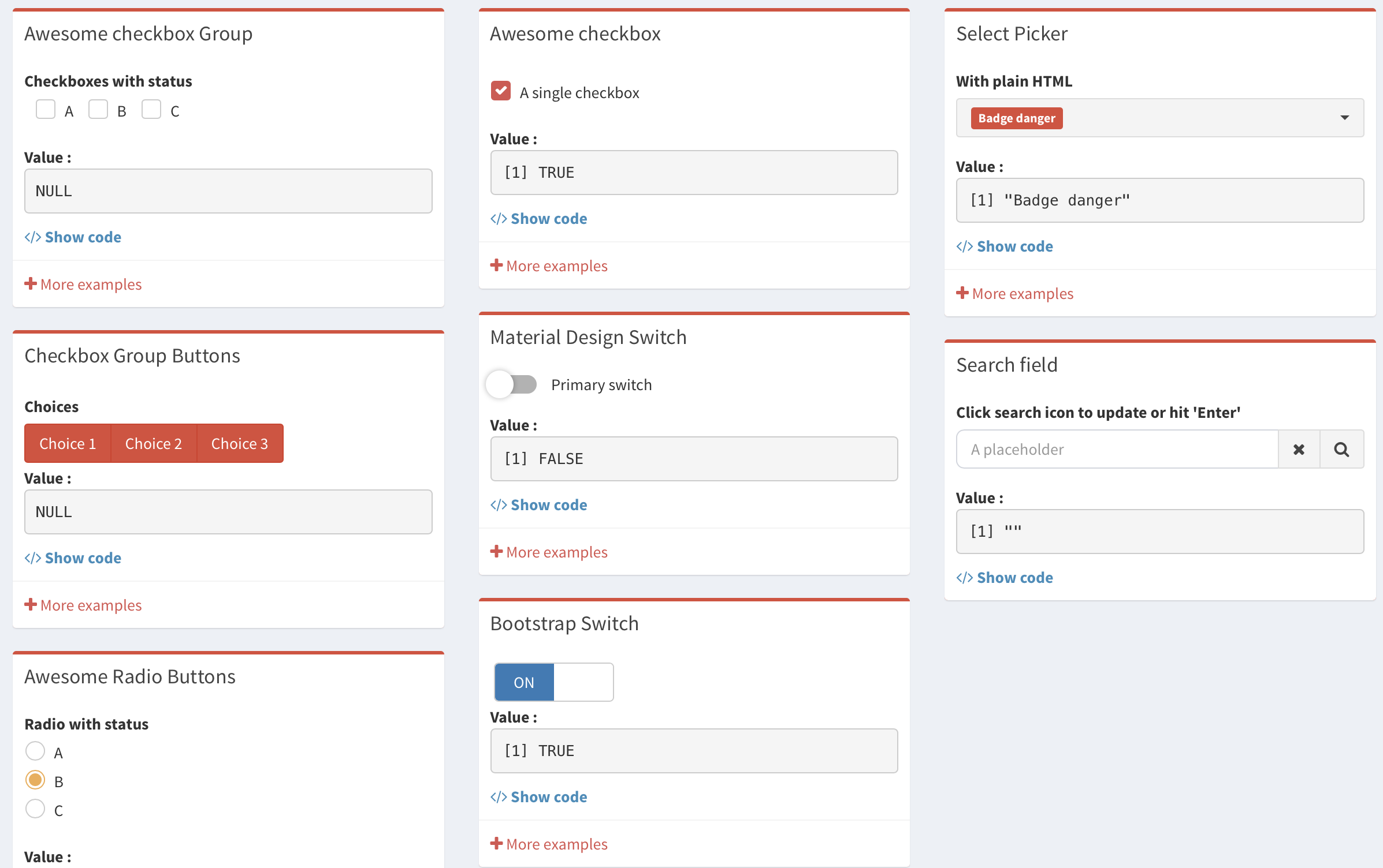
It is definitely one of my favorite shiny package, developed by the dreamRs team based in Paris. Besides, it is still under active development (Github). shinyWidgets offers a wide choice of custom shiny-widgets such as:
- switch inputs with both bootstrap and material design
- dropdown buttons
- slider text (my favorite widget) with customisable range
- sweet alerts (better design than classic boostrap alerts or shinyNotifications).
After installing this package you can preview a showcase as follows:
library(shinyWidgets)
shinyWidgetsGallery()
Keep up the good work Victor!
Other Options
shinyMenus
Another package developed by Eric Bailey. More informations here.
Notice that adding a sliderInput in the menubar (smNavBar(...)) does not work perfectly and will add an ugly extra vertical space. Using the sliderTextInput() of shinyWidget
renders slightly better. To summarise, there is no warranty that each widget will be fully
integrated without display issues. However, it is likely that you can fix these problems
by adding custom CSS or playing with options.
shinyBS (not updated anymore?)
This packages extends shiny’s capabilities by adding some bootstrap components:
- alerts
- create collapsible elements/panels
- adding tooltips and popovers
- modals
You can access the full documentation here:https://ebailey78.github.io/shinyBS/.
Be careful: this package is not updated (but still very good!).
Extend shinyBS: bsplus
In addition to providing extra bootstrap components, such as accordions and carousel, a function allows the user to include help text/popover inside shiny inputs, as follows:
numericInput(inputId = "foo", label = "Enter a number", value = 0) %>%
  shinyInput_label_embed(
    shiny_iconlink() %>%
    bs_embed_popover(title = "Number", content = "Not a complex number")
  )
This could be useful if you want to include a reset button just next to a slider input. However, you must handle the reset input on the server side, which is not provided by the package.
Other themes than Bootstrap
Argon Design
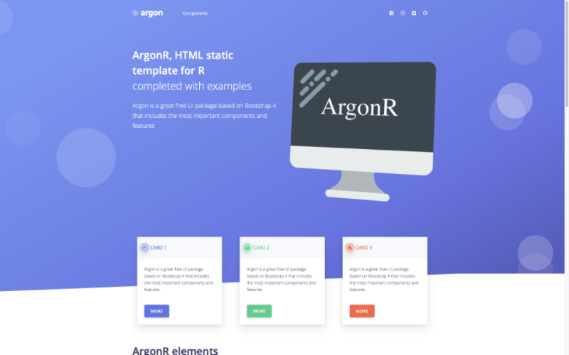
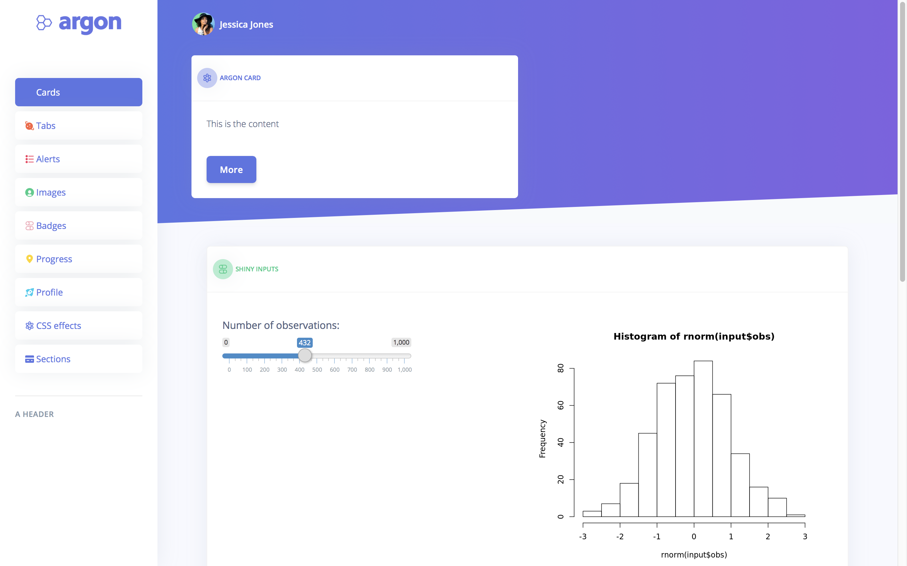
Argon CSS is originally developed by Creative Tim, from which a dashboard template was also created. I developed 2 new R packages to integrate argon and the argon dashboard template. These are respectively called argonR and argonDash and will be released soon on CRAN (currently submitted).
Materialize CSS
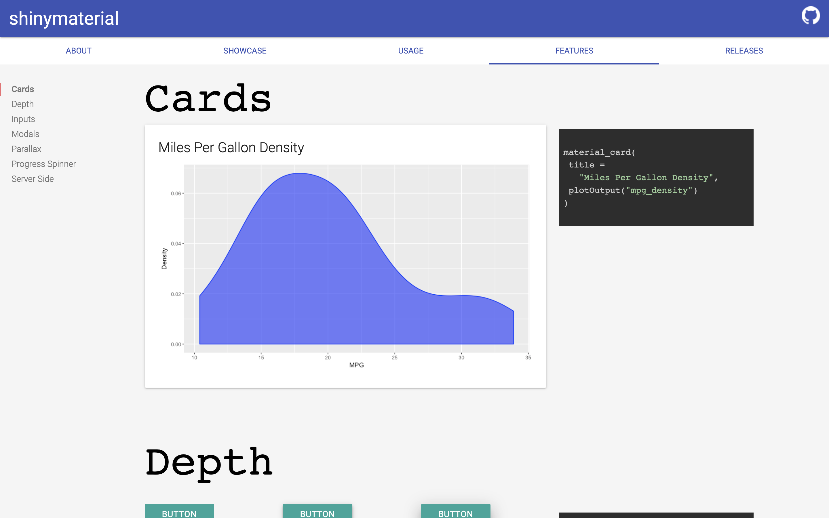
shinymaterial is a package provided by Eric Anderson (Github). I personally enjoy this custom template taken from the material design. By the way, a showcase is available here. A major drawback is that the navbarmenu cannot be customized very easily, unless after some manipulations.
Semantic design
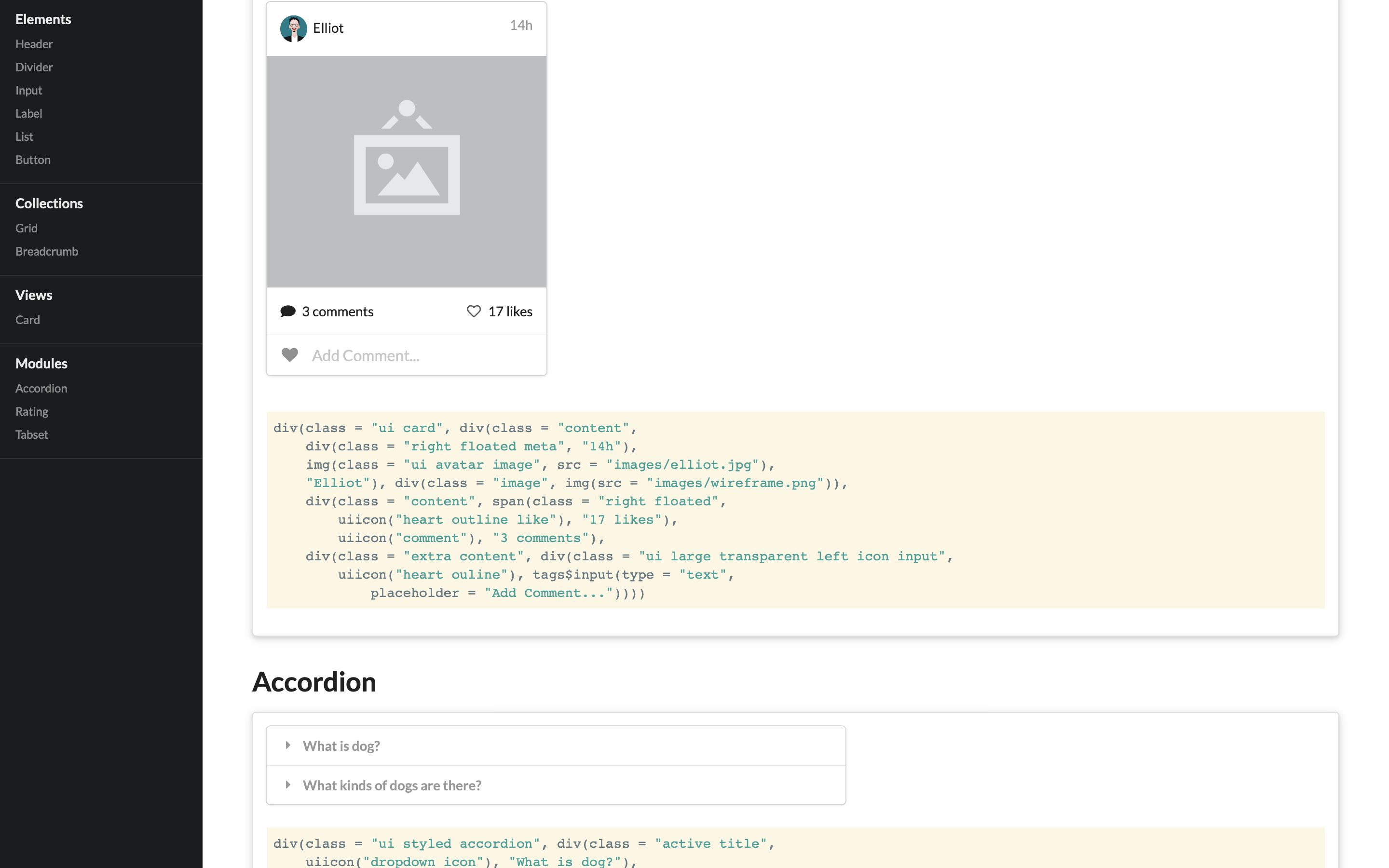
shiny.semantic developped by Appsilon is mainly dedicated to build dashboards, using the semantic design. The showcase is accessible here. Notice that this template is not compatible with bootstrap3 and thus requires to desactivate it before:
suppressDependencies("bootstrap")A feature I really appreciate is the card widget as well as rating but I will have to report that inputs such as sliders are not part of this package, which implies to use input widgets from the shiny base package. I did not spend so much time working with this UI but I think it could be really promising and serious alternative to bootstrap!
Make your app more professional
shinycssloaders
It is convenient for the user to be notified when a shiny is processing data, especially when a task lasts more than 2 seconds. In this case, displaying a css-loader will indicate your users that your app is still working and did not crash. shinycssloader includes 8 different spinners, whom size can be customized. This package is available here
Improve alert messages: sweetalertR
Written by Kent Russell, this package enchances the actual alerts provided by bootstrap. It is highly customisable and can be downloaded from this link.
Create a sofisticated help section: rintrojs
While writing complex shiny apps, this tool can be very useful to create a nice and clear help menu. It is displayed similarly as during a powerpoint animation, each time focusing on a given element of the UI (that is included in the help text). You will find everything you need here.
Summary
As a result, if you aim at building outstanding apps, I would advise to spend some time considering these previous packages. Be careful about the compatibility problems, before going too far. Indeed, it is better to make some tests to avoid nasty surprises!
I will regularly update this article.
Update: 13/11/18
