17 Create template elements
The list of all available tabler layouts is quite impressive (horizontal, vertical, compressed, right to left, dark, …). In the next steps, we will focus on the dark-compressed template, leaving the reader to try other templates as an exercise.
17.1 Identify template elements
We are quite lucky since there is nothing fancy about the Tabler layout. As usual, let’s inspect the layout-condensed-dark.html (located /demo folder) in Figure 17.1.
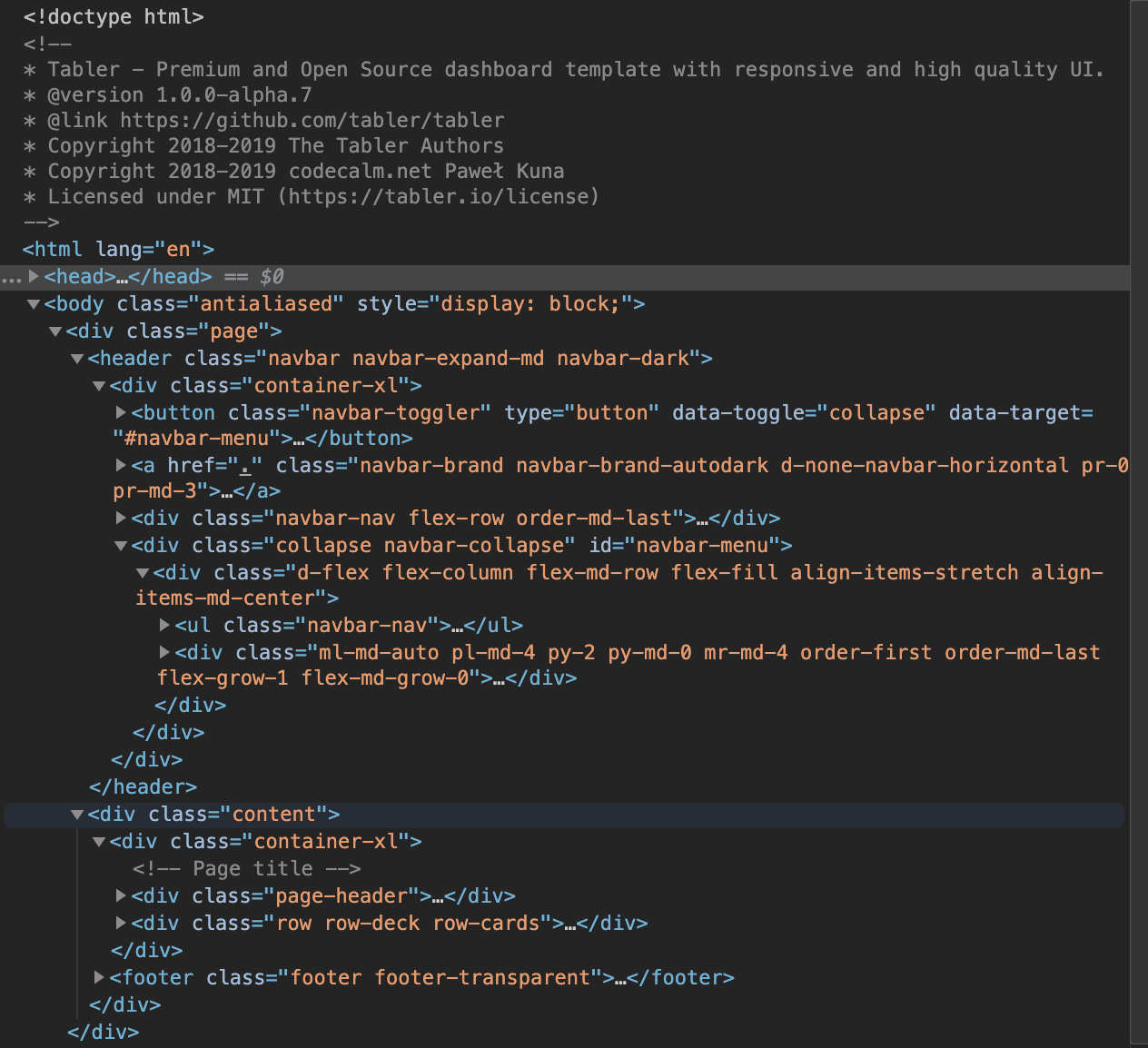
FIGURE 17.1: Tabler condensed layout.
There are two main components:
- the header containing the brand logo, the navigation and dropdown.
- the content containing the dashboard body as well as the footer.
The dashboard body does not mean <body> tag.
That is it for now.
17.2 Design the page layout
17.2.1 The page wrapper
Do you remember the structure of a basic HTML page seen in section 1.3? Well, if not, here is a reminder.
<!DOCTYPE HTML>
<html lang="en">
  <head>
    <!-- head content here -->
    <title>A title</title>
  </head>
  <body>
    <!-- body content here -->
  </body>
</html>
We actually don’t need to include the <html> tag since Shiny does it on the fly, as described earlier in section 5.7.1. Below we construct a list of tags with tagList(), including the head and the body. In the head, we have the meta tag, which has multiple purposes:
- Describe the encoding, which briefly controls what character can be displayed on the page. UTF-8 is a safe choice as it covers almost all existing characters.
- How to display the app on different devices. For instance the viewport meta tag handles the responsive web design.
width=device-width, allows the page width to vary depending on the user device.initial-scale=1handles the initial page zoom. - Set the favicon, which is an icon representing the website icon, that is the one you may see on the right side of the searchbar. Try Twitter for instance.
- …
The page title and favicon may be changed by the developer, so they may be included as function parameters. If you remember, there should also be CSS in the head but they are missing. Actually, the insertion of dependencies is achieved by our very own add_tabler_deps() function defined in Chapter 16. Tabler comes with two main themes, namely white and dark, which may be applied through the <body> class attribute (respectively, antialiased theme-dark and antialiased). The … parameter contains other template elements like the header and the dashboard body, which remain to be designed. As shown in Figure 16.1, the Tabler dashboard template may contain a navigation bar as well as a footer. As they are not mandatory, we don’t create dedicated parameters and pass all elements in the ... slot:
tabler_page <- function(..., dark = TRUE, title = NULL,
                        favicon = NULL){

  # head
  head_tag <- tags$head(
    tags$meta(charset = "utf-8"),
    tags$meta(
      name = "viewport",
      content = "
        width=device-width,
        initial-scale=1,
        viewport-fit=cover"
    ),
    # ... Elements omitted for space reasons
    tags$link(
      rel = "shortcut icon",
      href = favicon,
      type="image/x-icon"
    )
  )

  # body
  body_tag <- add_tabler_deps(
    tags$body(
      tags$div(
        class = paste0("antialiased ", if (dark) "theme-dark"),
        style = "display: block;",
        tags$div(class = "page", ...)
      )
    )
  )

  tagList(head_tag, body_tag)
}
The whole code maybe found in the {OSUICode} side package.
Below we quickly test if a Tabler element renders well, to confirm whether our setup is adequate. To do this, we include a card element taken from the demo HTML page, using HTML().
Let’s be clear: this is only for testing purposes. In production, you should avoid this as much as possible because of security issues and the bad readability of the code.
This also checks that our basic Shiny input/output system works as expected with a textInput() linked to a textOutput() to provide the card title:
### RUN ###
# OSUICode::run_example(
#  "tabler/test-template",
#   package = "OSUICode"
# )

### APP CODE ###
library(shiny)
library(OSUICode)

card <- '
  <div class="card">
    <div class="card-status-top bg-danger"></div>
    <div class="card-body">
      <h3 class="card-title">
        <div id="value" class="shiny-text-output"></div>
      </h3>
      <p>This is some text within a card body.</p>
    </div>
  </div>
'

ui <- tabler_page(
  textInput("caption", "Title", "Card title"),
  HTML(card),
title = "Tabler test"
)
server <- function(input, output) {
  output$value <- renderText({ input$caption })
}
shinyApp(ui, server)
OK, our card and the shiny element work like a charm, which is a good start. Now we may focus on the aesthetics.
17.2.2 The body content
In this part, we translate the dashboard body HTML code to R. As a reminder, the html2r by Alan Dipert substantially speeds up the conversion process. You copy the code in the HTML text area, click on convert and get the R Shiny output. We create a function called tabler_body(). The … parameter holds all the dashboard body elements, and the footer is dedicated for the future tabler_footer() function.
tabler_body <- function(..., footer = NULL) {
  div(
    class = "content",
    div(class = "container-xl", ...),
    tags$footer(class = "footer footer-transparent", footer)
  )
}
Let’s test it with the previous example.
ui <- tabler_page(tabler_body(h1("Hello World")))
server <- function(input, output) {}
shinyApp(ui, server)
Way better!
17.2.3 The footer
The footer is composed of left and right containers. We decide to create parameters left and right in which the user may pass any elements:
tabler_footer <- function(left = NULL, right = NULL) {
  div(
    class = "container",
    div(
      class = "row text-center align-items-center
      flex-row-reverse",
      div(class = "col-lg-auto ml-lg-auto", right),
      div(class = "col-12 col-lg-auto mt-3 mt-lg-0", left)
    )
  )
}
All the class attributes are taken from the original HTML template.
If you are already familiar with Bootstrap 4, you may easily customize the style. The main container leverages the flexbox model, shown in section 6.5.5.2. In short, row means that all elements are aligned on a row; text-center and align-items-center handle the text and content centering. flex-row-reverse displays elements in a reversed order.
Notice also that a row element contains columns created with the col class.
As above, let’s check our brand-new element (Figure 17.2).
### RUN ###
# OSUICode::run_example(
#  "tabler/basic-template",
#   package = "OSUICode"
# )

### APP CODE ###
library(shiny)
library(OSUICode)

ui <- tabler_page(
  tabler_body(
    p("Hello World"),
    footer = tabler_footer(
      left = "Rstats, 2020",
      right = a(href = "https://www.google.com", "More")
    )
  )
)
server <- function(input, output) {}
shinyApp(ui, server)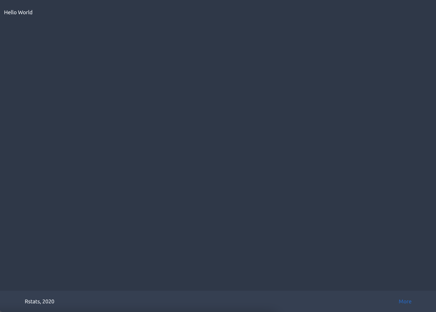
FIGURE 17.2: Tabler basic structure with content and footer.
17.2.4 The navbar (or header)
This function is called tabler_header(). In the Tabler template, the header has the
navbar navbar-expand-md navbar-light classes. We don’t need the navbar-light class
since we are only interested in the dark theme. As shown in Figure 17.3, the header is composed of four elements:
- The navbar toggler is only visible when we reduce the screen width, like on mobile devices.
- The brand image
- The navigation menu.
- The dropdown menus (this is not mandatory).
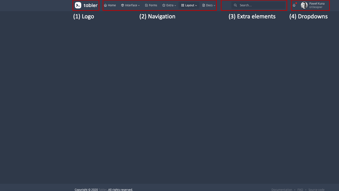
FIGURE 17.3: Tabler header structure.
You may have a look at the Bootstrap 4 documentation for extra configuration and layout.
Each of these elements will be considered a parameter to the tabler_navbar() function, except the navbar toggler, which is a default element and must not be removed:
tabler_navbar <- function(..., brand_url = NULL,
                          brand_image = NULL, nav_menu,
                          nav_right = NULL) {
  # SEE BELOW
}
Morever, we only show the brand element when it is provided. The …
parameter is a slot for extra elements (between the menu and dropdowns).
In the following, we start by creating the main container, that is
header_tag and its unique child container_tag:
header_tag <- tags$header(class = "navbar navbar-expand-md")
container_tag <- tags$div(class = "container-xl")
The latter has four children: toggler_tag, brand_tag, dropdown_tag and navmenu_tag. toggler_tag is only visible on small screen devices or when the browser window’s width is reduced. It consists of a button that has two important attributes data-toggle and data-target. They are part of the Bootstrap 4 template and briefly mean that the button will toggle a collapsible element having the navbar-menu unique id. The toggle icon is provided in a simple span element:
# toggler for small devices (must not be removed)
toggler_tag <- tags$button(
  class = "navbar-toggler",
  type = "button",
  `data-toggle` = "collapse",
  `data-target` = "#navbar-menu",
  span(class = "navbar-toggler-icon")
)
The navmenu_tag is the toggler_tag target, linked by the id and the collapse class. It is a container leveraging Flexbox, that will host the not yet defined nav_menu elements. In the following code, you probably notice some outstanding classes like mr-md-4, py-2. It corresponds to the Bootstrap 4 spacing system. Overall, m stands for margin while p means padding. x, y, t, b, l and r set the direction. The spacing value is an integer whose value ranges between 0 and 5 (or set to auto). Keep in mind the following rule {sides}-{breakpoint}-{size}, where breakpoint may be one of sm, md, lg and xl. If you remember the CSS media queries section 6.5.6, this is the same principle: pl-md-4 will apply a padding on the left side for all devices with a screen width of at least 768px (md), thereby excluding small and extra-small devices (sm, xs).
navmenu_tag <- div(
  class = "collapse navbar-collapse",
  id = "navbar-menu",
  div(
    class = "d-flex flex-column flex-md-row flex-fill
    align-items-stretch align-items-md-center",
    nav_menu
  ),
  if (length(list(...)) > 0) {
    div(
      class = "ml-md-auto pl-md-4 py-2 py-md-0 mr-md-4
      order-first order-md-last flex-grow-1 flex-md-grow-0",
      ...
    )
  }
)
The brand_tag is an optional image with navbar-brand main class:
# brand elements
  brand_tag <- if (!is.null(brand_url) ||
                   !is.null(brand_image)) {
    a(
      href = if (!is.null(brand_url)) {
        brand_url
      } else {
        "#"
      },
      class = "navbar-brand navbar-brand-autodark
      d-none-navbar-horizontal pr-0 pr-md-3",
      if(!is.null(brand_image)) {
        img(
          src = brand_image,
          alt = "brand Image",
          class = "navbar-brand-image"
        )
      }
    )
}dropdown_tag:
dropdown_tag <- if (!is.null(nav_right)) {
  div(class = "navbar-nav flex-row order-md-last", nav_right)
}
Remember that container_tag has to contain the four previously defined children tags. In this situations, htmltools functions like tagAppendChild() and tagAppendChildren() are game changers to better organize the code and make it more maintainable.
# ... other tags defined above
container_tag <- tagAppendChildren(
    container_tag,
    toggler_tag,
    brand_tag,
    dropdown_tag,
    navmenu_tag
  )

# Final navbar wrapper
tagAppendChild(header_tag, container_tag)
Users never know in advance how extra features will be added to that component. Hence being cautious at the very beginning is crucial! The tabler_navbar() full code is given here.
The navbar menu is the main navbar component. The … parameter is a slot for the menu items.
Compared to the original Tabler dashboard template where there is only the navbar-nav class, we have to add at least, the nav class to make sure items are correctly activated/inactivated. The nav-pills class is to select pills instead of basic tabs (see here), which is nothing more than a cosmetic consideration. Notice the ul tag that will contain li elements, that is the navbar items:
tabler_navbar_menu <- function(...) {
  tags$ul(class = "nav nav-pills navbar-nav", ...)
}
Besides, each navbar menu item could be either a simple button or contain multiple menu sub-items. For now, we only focus on simple items.
17.2.4.1 Navbar navigation
The navbar is crucial since it drives the template navigation. We would like to associate each item to a separate page in the body content. This would allow us to navigate to a new page each time we change an item. In brief, it is very similar to the Shiny tabsetPanel() function.
In HTML, menu items are <a> tags (links) with a given href attribute pointing to a specific page located in the server files. With Shiny, as applications are single page by design, we can’t split our content into multiple pages. The strategy here is to create a tabbed navigation, to mimic multi-pages layout.
Let’s see how the tab navigation works. In the menu list, all items must have:
- A data-toggle attribute set to
taborpill. - A href or data-target attribute holding a unique id, being mandatory since it points the menu item to the corresponding body content.
Importantly, href navigation appears to be broken on shinyapps.io, RStudio Connect (actually all rstudio products relying on workers to spread the user load across multiple R processes).
Therefore, we’ll choose the data-target attribute.
On the body side, tab panels are contained in a tabset panel (simple div container), have a role attribute set to tabpanel and an id corresponding to the data-target passed in the menu item. The exact match between id and data-target is mandatory, as shown in Figure 17.4.
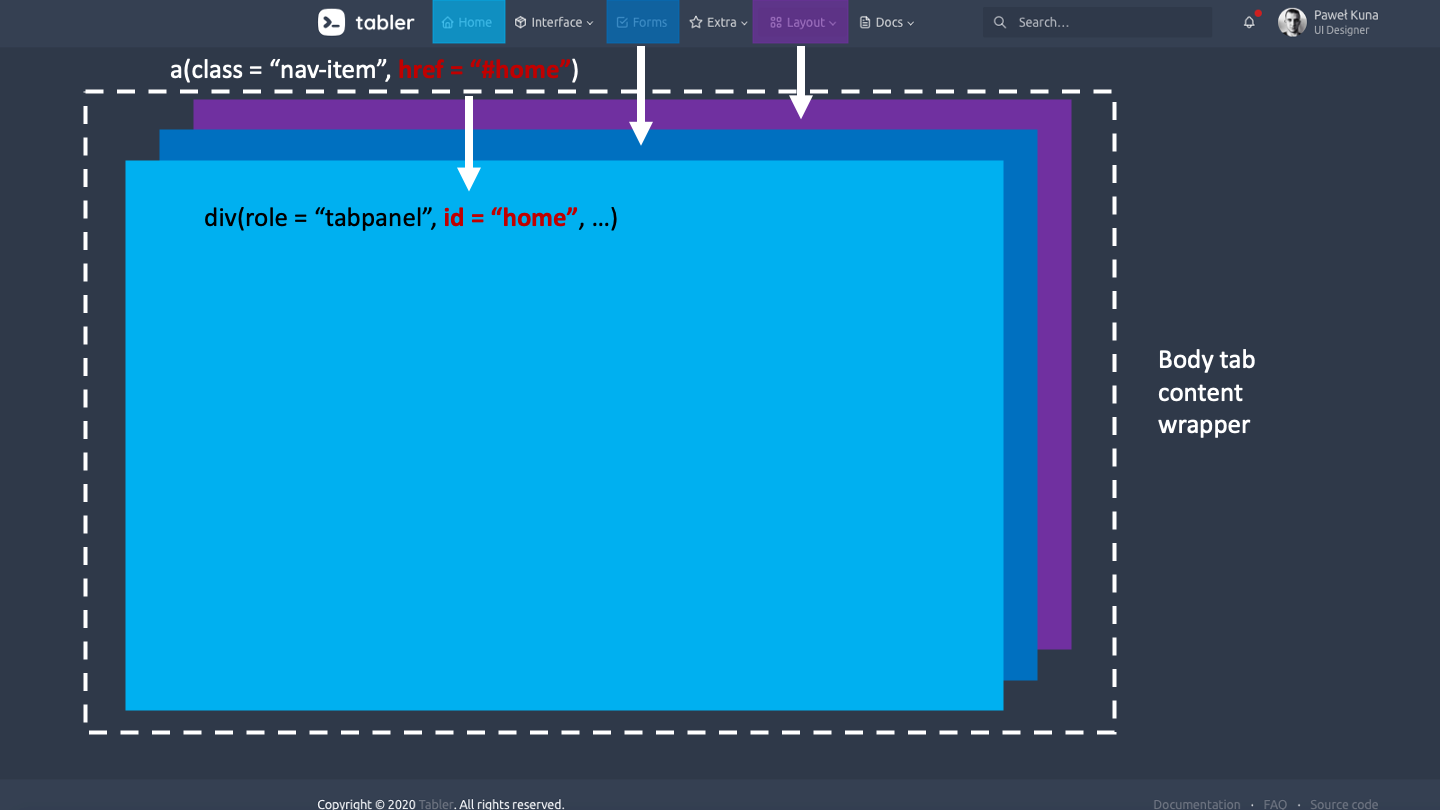
FIGURE 17.4: Tabler tabset panel: main principle.
Below, we propose a possible implementation of a menu item, as well as the corresponding body tab panel. The text parameter corresponds to the nav item text displayed in the menu. We also added an optional icon and the ability to select the item at start:
tabler_navbar_menu_item <- function(text, tabName, icon = NULL,
                                    selected = FALSE) {

  item_cl <- paste0("nav-link", if (selected) " active")

  tags$li(
    class = "nav-item",
    a(
      class = item_cl,
      `data-target` = paste0("#", tabName),
      `data-toggle` = "pill",
      `data-value` = tabName,
      role = "tab",
      span(class = "nav-link-icon d-md-none
           d-lg-inline-block", icon),
      span(class = "nav-link-title", text)
    )
  )
}
We also decided to add a fade transition effect between tabs, as per Bootstrap 4 documentation, which consists of the fade extra class:
tabler_tab_items <- function(...) {
  div(class = "tab-content", ...)
}

tabler_tab_item <- function(tabName = NULL, ...) {
  div(
    role = "tabpanel",
    class = "tab-pane fade container-fluid",
    id = tabName,
    ...
  )
}
What about testing this in a Shiny app?
### RUN ###
# OSUICode::run_example(
#  "tabler/navbar",
#   package = "OSUICode"
# )

### APP CODE ###
library(shiny)
library(OSUICode)

ui <- tabler_page(
  tabler_navbar(
    brand_url = "https://preview-dev.tabler.io",
    brand_image = "https://preview-dev.tabler.io/static/logo.svg",
    nav_menu = tabler_navbar_menu(
      tabler_navbar_menu_item(
        text = "Tab 1",
        tabName = "tab1",
        selected = TRUE
      ),
      tabler_navbar_menu_item(
        text = "Tab 2",
        tabName = "tab2"
      )
    )
  ),
  tabler_body(
    tabler_tab_items(
      tabler_tab_item(
        tabName = "tab1",
        p("Hello World")
      ),
      tabler_tab_item(
        tabName = "tab2",
        p("Second Tab")
      )
    ),
    footer = tabler_footer(
      left = "Rstats, 2020",
      right = a(href = "https://www.google.com")
    )
  )
)
server <- function(input, output) {}
shinyApp(ui, server)
At this point you might argue that we did not even validate the template elements. For instance, going back to the tabler_navbar_menu_item function, we find the following possible issues:
- What happens if the user provides an invalid tabName,
i.e. a text that is not valid for jQuery like
tab&?++? - What happens if the user accidentally activates two tabs at start?
We see later in Chapter 20 how to validate those parameters.
17.2.4.2 Fine-tune tabs behavior
Quite good, isn’t it? You notice however that even if the first tab is selected by default, its content is not shown. To fix this, we apply our jQuery skills. According to the Bootstrap documentation, we must trigger the show event on the active tab at start, as well as add the classes show and active to the associated tab panel in the dashboard body. We therefore target the nav item that has the active class and if no item is found, we select the first item by default and activate its body content.
$(function() {
  // this makes sure to trigger the show event on
  // the active tab at start
  let activeTab = $('#navbar-menu .nav-link.active');
  // if multiple items are found
  if (activeTab.length > 0) {
    let tabId = $(activeTab).attr('data-value');
    $(activeTab).tab('show');
    $(`#${tabId}`).addClass('show active');
  } else {
    $('#navbar-menu .nav-link')
      .first()
      .tab('show');
  }
});
This script is included in the the below app www folder. We see in Chapter 18 that custom input binding may perfectly handle this situation and are actually preferred.
### RUN ###
# OSUICode::run_example(
#  "tabler/navbar-bis",
#   package = "OSUICode"
# )
The result is shown in Figure 17.5. We’d also suggest including at least one input/output per tab, to test whether everything works properly.
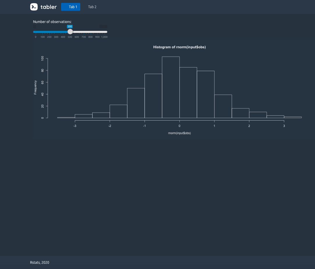
FIGURE 17.5: Tabler template with navbar.
Looks like we are done for the main template elements. Actually, wouldn’t it be better to include, at least, card containers?
17.2.5 Card containers
Card are a central piece of template as they may contain visualizations, metrics and much more, generally enhancing content visibility. Thus, this is not a hazard why I choose this component and fortunately, Tabler offers a large choice of card containers.
17.2.5.1 Classic card
What we call a classic card is like the shinydashboard box() container. The card structure has key elements:
- A width to control the space taken by the card in the Bootstrap grid.
- A title, in general in the header (Tabler does always not follow this rule and header is optional).
- A body where the main content is.
- Style elements like color statuses.
- A footer (optional, Tabler does not include this).
A comprehensive list of all Tabler card features may be found here. To be faster, we copy the following HTML code in the html2R Shiny app to convert it to Shiny tags:
<div class="col-md-6">
  <div class="card">
    <div class="card-status-top bg-danger"></div>
    <div class="card-body">
      <h3 class="card-title">Title</h3>
      <p>Some Text.</p>
    </div>
  </div>
</div>
Below is the result. The next step consists of replacing all content by parameters to the tabler_card() function, whenever necessary. For instance, the first <div> sets the card width. The Bootstrap grid ranges from 1 to 12, so why not create a width parameter to control the card size. We proceed similarly for the title, status, body content. It seems reasonable to allow title to be NULL (if so, the title is not shown), same thing for the status. Regarding the card default width, a value of six also makes sense, which would take half of the row:
tabler_card <- function(..., title = NULL, status = NULL,
                        width = 6, stacked = FALSE,
                        padding = NULL) {

  card_cl <- paste0(
    "card",
    if (stacked) " card-stacked",
    if (!is.null(padding)) paste0(" card-", padding)
  )

  status_tag <- if (!is.null(status)) {
    div(class = paste0("card-status-top bg-", status))
  }

  body_tag <- div(
    class = "card-body",
    # we could have a smaller title like h4 or h5...
    if (!is.null(title)) {
      h3(class = "card-title", title)
    },
    ...
  )

  main_wrapper <- div(class = paste0("col-md-", width))
  card_wrapper <- div(class = card_cl)

  card_wrapper <- tagAppendChildren(
    card_wrapper, status_tag, body_tag
  )
  tagAppendChild(main_wrapper, card_wrapper)
}
In the meantime, it would be also convenient to be able to display cards in the same row. Let’s create the tabler_row() function:
tabler_row <- function(...) {
  div(class = "row row-deck", ...)
}
Below, we show an example of the tabler_card() function, in combination with the apexcharter package. The whole code may be printed with OSUICode::get_example("tabler/card").
### RUN ###
# OSUICode::run_example(
#  "tabler/card",
#   package = "OSUICode"
# )
The code output is shown in Figure 17.6.
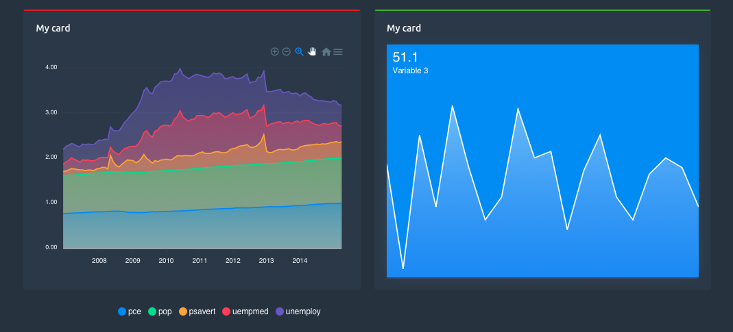
FIGURE 17.6: Tabler card component.
17.2.6 Ribbons: card components
Let’s finish this part by including a card component, namely the ribbon.
tabler_ribbon <- function(..., position = NULL, color = NULL,
                          bookmark = FALSE) {

  ribbon_cl <- paste0(
    "ribbon",
    if (!is.null(position)) sprintf(" bg-%s", position),
    if (!is.null(color)) sprintf(" bg-%s", color),
    if (bookmark) " ribbon-bookmark"
  )
  div(class = ribbon_cl, ...)
}
Integrating the freshly created ribbon component requires modifying the card structure since the ribbon is added after the body tag, and no parameter is associated with this slot. We could also modify the tabler_card() function, but htmltools offers tools to help us. Since the ribbon should be put after the card body, we may think about the tagAppendChild() function, introduced in Chapter 2:
# add the ribbon to a card
my_card <- tabler_card(title = "Ribbon", status = "info")

my_card$children[[1]] <- tagAppendChild(
  my_card$children[[1]],
  tabler_ribbon(
    icon("info-circle", class = "fa-lg"),
    bookmark = TRUE,
    color = "red"
  )
)
Now, we check how it looks in a Shiny app.
### RUN ###
# OSUICode::run_example(
#  "tabler/ribbon",
#   package = "OSUICode"
# ) 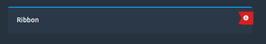
FIGURE 17.7: Tabler ribbon component.
17.2.7 Icons
Not mentioned before, but we may include Font Awesome icons provided with Shiny, as well as other libraries. Moreover, Tabler has a internal svg library located here.
17.3 Exercises
- Have a look at this page. Select two elements and create the corresponding R functions.
- Leverage the new htmltools
tagQuery()API (see section 2.6) to rewrite thetabler_navbar()andtabler_card()functions.