19 Adding more interactivity
In this part, we are going to bring even more life to the template element. We first see how to enhance an existing static HTML component, through a simple progress bar example. Then we explore more complex elements involving specific Shiny patterns. By the end of the chapter, you will be able to implement components like the one showed in Figure 19.1.
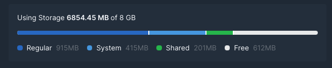
FIGURE 19.1: Stacked progress bar inside a card.
All the JavaScript handlers described below are gathered in an HTML dependency, as well as an input binding(s):
# contains bindings and other JS code
tabler_custom_js <- htmlDependency(
  name = "tabler-custom-js",
  version = "1.0.7",
  src = "tabler",
  package = "OSUICode",
  script = c(
    "tabler-update-navbar/navbarMenuBinding.js",
    "handlers/tabler_progress_handler.js",
    "handlers/tabler_toast_handler.js",
    "handlers/tabler_dropdown_handler.js",
    "handlers/tabler_insert_tab_handler.js"
  )
)
19.1 Custom progress bars
Progress bars are a good way to display metrics related to a progress, for instance tracking the number of remaining tasks for a project. In general, those elements are static HTML. Hence, it would be interesting to update the current value from the server side. Since it is not an proper input element, implementing an input binding is inappropriate, and we decide to proceed with a custom handler. We first create the tabler_progress() tag, which is mainly composed of:
-
stylegives the current progress value. This is the main element. -
minandmaxare bounds, in general between 0 and 100. -
idensures the progress bar uniqueness, thereby avoiding conflicts. -
aria-...parameters are accessibility elements.
tabler_progress <- function(id = NULL, value) {
  div(
    class = "progress",
    div(
      id = id,
      class = "progress-bar",
      style = paste0("width: ", value, "%"),
      role = "progressbar",
      `aria-valuenow` = as.character(value),
      `aria-valuemin` = "0",
      `aria-valuemax` = "100",
      span(class = "sr-only", paste0(value,"% complete"))
    )
  )
}
The next element is the update_tabler_progress() function, which sends two elements from R to JS.
How to handle custom messages in Shiny modules? Well, it is pretty straightforward. We wrap any id with the module namespace given by session$ns() before sending it to JS. You may even do it by default since session$ns() returns "".
- The progress id wrapped in
session$ns. - The new value.
update_tabler_progress <- function(
  id,
  value,
  session = shiny::getDefaultReactiveDomain()
) {
  message <- list(id = session$ns(id), value = value)
  session$sendCustomMessage(
    type = "update-progress",
    message
  )
}
On the JS side, we leverage the well-known Shiny.addCustomMessageHandler. As mentioned in Chapter 10, sendCustomMessage and addCustomMessageHandler are connected by the type parameter. This is crucial! Moreover, as the sent message is a R list, it becomes an JSON, meaning that elements must be accessed with a . in JS:
$(function () {
  Shiny.addCustomMessageHandler(
    'update-progress', function(message) {
    $('#' + message.id).css('width', message.value +'%');
  });
});
We finally test these components in a simple app, whose output is depicted in Figure 19.2:
### RUN ###
# OSUICode::run_example(
#  "tabler/update-progress",
#   package = "OSUICode"
# )

### APP CODE ###
library(shiny)
library(shinyWidgets)
library(OSUICode)

ui <- tabler_page(
  tabler_body(
    noUiSliderInput(
      inputId = "progress_value",
      label = "Progress value",
      min = 0,
      max = 100,
      value = 20
    ),
    tabler_progress(id = "progress1", 12)
  )
)

server <- function(input, output, session) {
  observeEvent(input$progress_value, {
    update_tabler_progress(
      id = "progress1",
      input$progress_value
    )
  })
}
shinyApp(ui, server)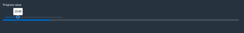
FIGURE 19.2: Progress bar component updated by a slider.
Is there a way to directly update the progress from the client that would avoid to exchange data between R and JS, thereby saving some time?
The idea is to get rid of the classic session$sendCustomMessage and Shiny.addCustomMessageHandler method. We could directly create a function that inserts a script in the UI taking a trigger and target as main parameters. This function would have to be inserted multiple times if multiple triggers had to update the same target. The JS logic is slightly different:
- We have to wait for Shiny to be connected so that the JS
Shinyobject is ready. - We recover the trigger element with any JS/jQuery method.
- We leverage the noUiSlider API to listen to any update in the range. It’s fine because the slider instance has already been initialized in the shinyWidget input binding. This would not work if we were not waiting for Shiny to be connected (you may try)! Notice the use of
this.get()in the event listener, which avoids repeatingslider.noUiSlider - We modify the
widthCSS property of the target as in the previous example.
$(document).on('shiny:connected', function(event) {
  let slider = document.getElementById('triggerId');
  slider.noUiSlider.on('update', function(event) {
    $('#targetId').css('width', this.get() + '%');
  });
});
To insert this script in the app UI, we create update_tabler_progress2 that just wraps it inside a tags$script.
update_tabler_progress2 <- function(trigger, target) {
  tags$script(
    paste0(
      "$(document).on('shiny:connected', function(event) {
        let slider = document.getElementById('", trigger, "');
        slider.noUiSlider.on('update', function(event) {
          $('#", target, "').css('width', this.get() + '%');
        });
      });
      "
    )
  )
}
### RUN ###
# OSUICode::run_example(
#  "tabler/update-progress-2",
#   package = "OSUICode"
# )

### APP CODE ###
library(shiny)
library(OSUICode)

ui <- tabler_page(
  update_tabler_progress2("progress_value", "progress1"),
  update_tabler_progress2("progress_value2", "progress2"),
  tabler_body(
    fluidRow(
      noUiSliderInput(
        inputId = "progress_value",
        label = "Progress value 1",
        min = 0,
        max = 100,
        value = 20
      ),
      noUiSliderInput(
        inputId = "progress_value2",
        label = "Progress value 2",
        min = 0,
        max = 100,
        value = 80,
        color = "red"
      )
    ),
    tabler_progress(id = "progress1", 12),
    br(), br(),
    tabler_progress(id = "progress2", 100)
  )
)

server <- function(input, output, session) {}
shinyApp(ui, server)
Question: Run the above example in an external web browser, then stop the app from RStudio. Try to move both sliders. What happens for the progress bars? Compare with a classic update function. How could you explain this? Answer: as we are not sending a message through the websocket with session$sendCustomMessage, the progress bar still updates even though the websocket connection is closed.
Overall this way is a bit more complex. Yet, assuming an app with data manipulation, tons of inputs and visualizations, everything that can be done from the client (web browser) is less work for the R server part and a better end-user experience! Building outstanding Shiny apps is not only designing amazing user interfaces, it’s also about optimization and speed as mentioned by Colin Fay et al. in their book (Fay et al. 2020).
19.2 User feedback: toasts
Toasts are components to send discrete user feedback, contrary to modals which open in the middle of the page. Toasts may open on all sides of the window and are similar to the Shiny notifications (see here). The Tabler toast component is built on top of Bootstrap 4. Therefore, we rely on this documentation.
19.2.1 Toast skeleton
The skeleton is the HTML structure of the toast:
<div class="toast show" role="alert" aria-live="assertive"
aria-atomic="true" data-autohide="false" data-toggle="toast">
<div class="toast-header">
<span class="avatar mr-2"
style="background-image: url(...)"></span>
<strong class="mr-auto">Mallory Hulme</strong>
<small>11 mins ago</small>
<button type="button" class="ml-2 close"
data-dismiss="toast" aria-label="Close">
<span aria-hidden="true">×</span>
</button>
</div>
<div class="toast-body">
Hello, world! This is a toast message.
</div>
</div>Toasts are mainly composed of a header and a body. There might be a close button in case the toast does not hide itself after a period of time. If multiple toasts appear one after each others, they are stacked, the latest being at the bottom of the stack. The position is controlled with the style attribute like style="position: absolute; top: 0; right: 0;" for a top-right placement. Accessibility parameters like aria-live are detailed here.
19.2.2 The toast API
Toasts have a JS API to control their behavior, for instance $('<toast_selector>').toast(option), where option is a JSON with the following fields:
- animation applies a CSS fade transition to the toast and is TRUE by default.
- autohide automatically hides the toast (TRUE by default).
- delay is the delay to hide the toast (500 ms).
There are three methods: hide, show and dispose (dispose ensures the toast does not appear anymore). Finally, we may fine-tune the toast behavior with four events: show.bs.toast, shown.bs.toast, hide.bs.toast, hidden.bs.toast (like for tabs).
19.2.3 R implementation
We first create the toast skeleton in a tabler_toast() function. We assume our toast will eventually hide automatically, so we may remove the delete button as well as the data-autohide="false attribute. All parameters are optional except the toast id, which is required to toggle the toast:
tabler_toast <- function(id, title = NULL, subtitle = NULL,
                         ..., img = NULL) {
  # SEE BELOW
}
The first part is the toast header, which is a direct translation of the above HTML structure. Notice how we handle optional parameters with if (!is.null(<PARAM>)) so that the tag is not included if no value is given:
toast_header <- div(
  class = "toast-header",
  if (!is.null(img)) {
    span(
      class = "avatar mr-2",
      style = sprintf("background-image: url(%s)", img)
    )
  },
  if (!is.null(title)) strong(class = "mr-2", title),
  if (!is.null(subtitle)) tags$small(subtitle)
)
The body is the simplest part, it receives the main content in ...:
toast_body <- div(class = "toast-body", ...)The wrapper is the external toast tag that will received both body and header elements, owing to tagAppendChildren():
toast_wrapper <- div(
  id = id,
  class = "toast",
  role = "alert",
  style = "position: absolute; top: 0; right: 0;",
  `aria-live` = "assertive",
  `aria-atomic` = "true",
  `data-toggle` = "toast"
)

tagAppendChildren(toast_wrapper, toast_header, toast_body)
The whole code may be found in the {OSUICode} package (see https://github.com/DivadNojnarg/outstanding-shiny-ui-code/blob/101248eabda2bd2682c73c2998dbe7d53cb5eb78/R/tabler.R#L820).
We create the show_tabler_toast() function. Since the toast automatically hides, it does not make sense to create the hide function, as well as the dispose:
show_tabler_toast <- function(
  id,
  options = NULL,
  session = getDefaultReactiveDomain()
) {
  message <- dropNulls(
    list(
      id = session$ns(id),
      options = options
    )
  )
  session$sendCustomMessage(type = "tabler-toast", message)
}
Let’s design the corresponding JS handler. We first configure the toast and show it. Notice how we chained jQuery methods (see Chapter 10). We optionally add an event listener to capture the hidden.bs.toast event, so that we may trigger an action when the toast is closed. The input$id is used for that purpose in combination with the Shiny.setInputValue. Notice the extra parameter {priority: 'event'}: basically, once the toast is closed, input$id is always TRUE, thereby breaking the reactivity. Adding this extra parameter forces the evaluation of the input, although constant over time.
$(function() {
  Shiny.addCustomMessageHandler(
    'tabler-toast', function(message) {
      $(`#${message.id}`)
        .toast(message.options)
        .toast('show');

      // add custom Shiny input to listen to the toast state
      $(`#${message.id}`).one('hidden.bs.toast', function() {
        Shiny.setInputValue(
          message.id,
          true,
          {priority: 'event'}
        );
      });
  });
});
### RUN ###
# OSUICode::run_example(
#  "tabler/toast",
#   package = "OSUICode"
# )

### APP CODE ###
library(shiny)
library(OSUICode)

ui <- tabler_page(
  tabler_toast(
    id = "toast",
    title = "Hello",
    subtitle = "now",
    "Toast body",
    img = "https://preview-dev.tabler.io/static/logo.svg"
  ),
  tabler_button("launch", "Go!", width = "25%")
)

server <- function(input, output, session) {
  observe(print(input$toast))
  observeEvent(input$launch, {
    removeNotification("notif")
    show_tabler_toast(
      "toast",
      options = list(
        animation = FALSE,
        delay = 3000
      )
    )
  })

  observeEvent(input$toast, {
    showNotification(
      id = "notif",
      "Toast was closed",
      type = "warning",
      duration = 1,

    )
  })
}

shinyApp(ui, server)
The result of shown in Figure 19.3.
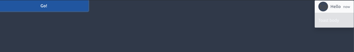
FIGURE 19.3: Tabler toast element.
19.2.4 Exercise
Based on the Tabler documentation, add the tabler_tooltip() function. Hint: you may also check the corresponding Bootstrap 4 help.
19.3 Transform an element in a custom action button
As seen in Chapter 18, any <button>, <a> element holding the action-button class may eventually become an action button. The Tabler template has dropdown menus in the navbar, and we would like to transform those dropdown items in action buttons. The tabler_dropdown() function takes the following parameters:
-
id is required by the
show_tabler_dropdown()(see below) function, which opens the menu. - title is the dropdown menu name.
- subtitle is optional text.
- img is an optional image.
-
… hosts the
tabler_dropdown_item()(see below).
tabler_dropdown <- function(..., id = NULL, title,
                            subtitle = NULL, img = NULL) {
  # SEE BELOW
}
We proceed step by step. The image tag is:
img_tag <- if (!is.null(img)) {
  span(
    class = "avatar",
    style = sprintf("background-image: url(%s)", img)
  )
}
The title tag accepts both title and subtitle parameters. It is given by:
title_tag <- div(
  class = "d-none d-xl-block pl-2",
  div(title),
  if (!is.null(subtitle)) {
    div(class = "mt-1 small text-muted", subtitle)
  }
)
The link tag contains both image tag and title tag:
link_tag <- tagAppendChildren(
  a(
    href = "#",
    id = id,
    class = "nav-link d-flex lh-1 text-reset p-0",
    `data-toggle` = "dropdown",
    `aria-expanded` = "false"
  ),
  img_tag,
  title_tag
)
The dropdown tag receives the main content:
dropdown_tag <- div(
  class = "dropdown-menu dropdown-menu-right",
  `aria-labelledby` = id,
  ...
)
Both link tag and dropdown tag are wrapped in an external tag:
tagAppendChildren(
  div(class = "nav-item dropdown"),
  link_tag,
  dropdown_tag
)
The whole code is located here.
To convert a dropdown item in an action button, we add the action-button class as well as the id parameter to recover the corresponding input id.
tabler_dropdown_item <- function(..., id = NULL) {
  a(
    id = id,
    class = "dropdown-item action-button",
    href = "#",
    ...
  )
}
We finally create the show_tabler_dropdown(), as well as the corresponding Shiny message handler.
show_tabler_dropdown <- function(
  id,
  session = getDefaultReactiveDomain()
) {
  session$sendCustomMessage(
    type = "show-dropdown",
    message = session$ns(id)
  )
}
To show the dropdown, we use the dropdown method, which is linked to the data-toggle="dropdown" of tabler_dropdown().
$(function() {
  Shiny.addCustomMessageHandler(
   'show-dropdown', function(message) {
      $(`#${message}`).dropdown('show');
  });
});
Let’s play with it (Figure 19.4).
### RUN ###
# OSUICode::run_example(
#  "tabler/dropdown",
#   package = "OSUICode"
# )

### APP CODE ###
library(shiny)
library(OSUICode)

ui <- tabler_page(
  tabler_navbar(
    brand_url = "https://preview-dev.tabler.io",
    brand_image = "https://preview-dev.tabler.io/static/logo.svg",
    nav_menu = NULL,
    tabler_dropdown(
      id = "mydropdown",
      title = "Dropdown",
      subtitle = "click me",
      tabler_dropdown_item(
        id = "item1",
        "Show Notification"
      ),
      tabler_dropdown_item(
        "Do nothing"
      )
    )
  ),
  tabler_body(
    tabler_button("show", "Open dropdown", width = "25%"),
    footer = tabler_footer(
      left = "Rstats, 2020",
      right = a(href = "https://www.google.com")
    )
  )
)
server <- function(input, output, session) {

  observeEvent(input$show, {
    show_tabler_dropdown("mydropdown")
  })

  observeEvent(input$item1, {
    showNotification(
      "Success",
      type = "message",
      duration = 2,

    )
  })
}
shinyApp(ui, server)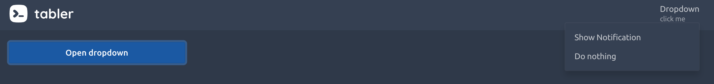
FIGURE 19.4: Tabler dropdown element.
19.4 Tab events
Do you remember about the navbar element and the tabsetpanel system of Chapter 17? Navs allow users to organize any app into several tabs, acting like a multi-page application. This is a powerful tool for Shiny since it is currently not straightforward to create multi-pages Shiny apps like anyone would do in a standard website. Navs rely on the Bootstrap 4 API but we only use a few JS functions.
19.4.1 Insert/remove tabs in tabsetpanel
How about dynamically inserting/removing tabs from a tabler_navbar()? We chose this example since it involves extra technical details about Shiny, especially process extra dependencies at render time.
How do we proceed? If you recall about the tabler_navbar_menu_item() and tabler_tab_item() coupling, inserting a tab implies inserting the trigger in the navigation menu as well as the content in the dashboard body. Therefore, we need to know the structure of what we insert. Below is a reminder:
-
tabler_navbar_menu_item()are<li>elements. -
tabler_tab_item()is a<div>element with specific classes.
<li class="nav-item">
  <a class="nav-link" href="#ww" data-toggle="pill"
    data-value="ww" role="tab">
    <span class="nav-link-icon d-md-none d-lg-inline-block">
    </span>
    <span class="nav-link-title">ww</span>
  </a>
</li>

<div role="tabpanel" class="tab-pane fade container-fluid"
  id="ww">
</div>
We design the insert_tabler_tab() function similar to the Shiny insertTab().
insert_tabler_tab <- function(
  inputId,
  tab,
  target,
  position = c("before", "after"),
  select = FALSE,
  session = getDefaultReactiveDomain()
) {
  # SEE BELOW
}
To handle shiny modules, we wrap the inputId in the session namespace session$ns.
inputId <- session$ns(inputId)We recover the provided new tab position, leveraging match.arg():
position <- match.arg(position)We create the menu item element based on the new tab and the above HTML structure:
navbar_menu_item <- tags$li(
  class = "nav-item",
  a(
    class = "nav-link",
    href = "#",
    `data-target` = paste0("#", session$ns(tab$attribs$id)),
    `data-toggle` = "pill",
    `data-value` = tab$attribs$id,
    role = "tab",
    tab$attribs$id
  )
)
Since JS does not understand Shiny tags, we have to convert both tab and the nav link to character:
tab <- as.character(tab)
navbar_menu_item <- as.character(navbar_menu_item)
We finally, build our message as a list, whose NULL elements are handled by dropNulls() and send it to JS with session$sendCustomMessage.
message <- dropNulls(
    list(
      inputId = inputId,
      content = tab,
      link = navbar_menu_item,
      target = target,
      position = position,
      select = select
    )
  )
session$sendCustomMessage(type = "insert-tab-1", message)
On the JS side, we capture the R message (list) in two elements:
-
$divTagcontains the tab content. -
$liTagcontains the tab link, i.e. the navigation part.
Depending on the position parameter, we use the insertAfter() and insertBefore() jQuery methods. Finally, if the newly inserted tab has to be selected, we activate the corresponding tab element with $(tablink).tab('show').
$(function() {
  Shiny.addCustomMessageHandler(
    'insert-tab-1', function(message) {
      // define div and li targets
      let $divTag = $(message.content);
      let $liTag = $(message.link);
      let targetId = '#' + message.target;
      if (message.position === 'after') {
        $divTag.insertAfter($(targetId));
        $liTag.insertAfter(
          $('[data-target="' + targetId + '"]')
            .parent()
        );
      } else if (message.position === 'before') {
        $divTag.insertBefore($(targetId));
        $liTag.insertBefore(
          $('[data-target="' + targetId + '"]')
            .parent()
        );
      }

      if (message.select) {
        // trigger a click on corresponding the new tab button.
        let newTabId = $divTag.attr('id');
        $('#' +
          message.inputId +
          ' a[data-target="#' +
          newTabId +'"]').tab('show');
      }
  });
});
### RUN ###
# OSUICode::run_example(
#  "tabler/insert-tab-1",
#   package = "OSUICode"
# )
If the tab is well inserted, we notice that the slider and the plot are not properly shown, as illustrated in Figure 19.5.
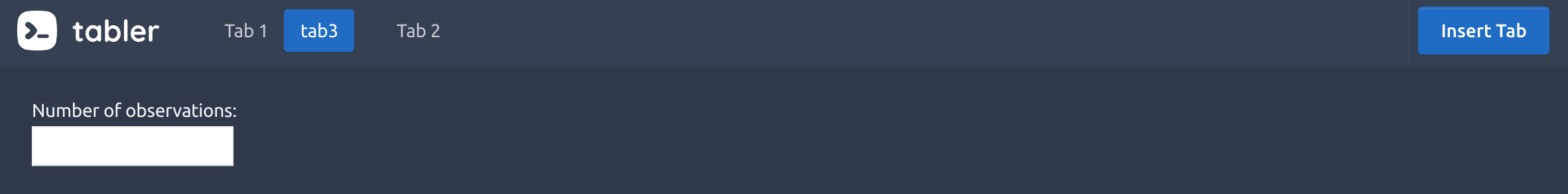
FIGURE 19.5: The newly inserted tab fails to render its content.
How could we explain that? It is a dependency issue: the slider input relies on a specific JS library, namely ionRangesSlider, as depicted in Figure 19.6. In our previous example, if you open the HTML inspector, the dependency is not included in the page.
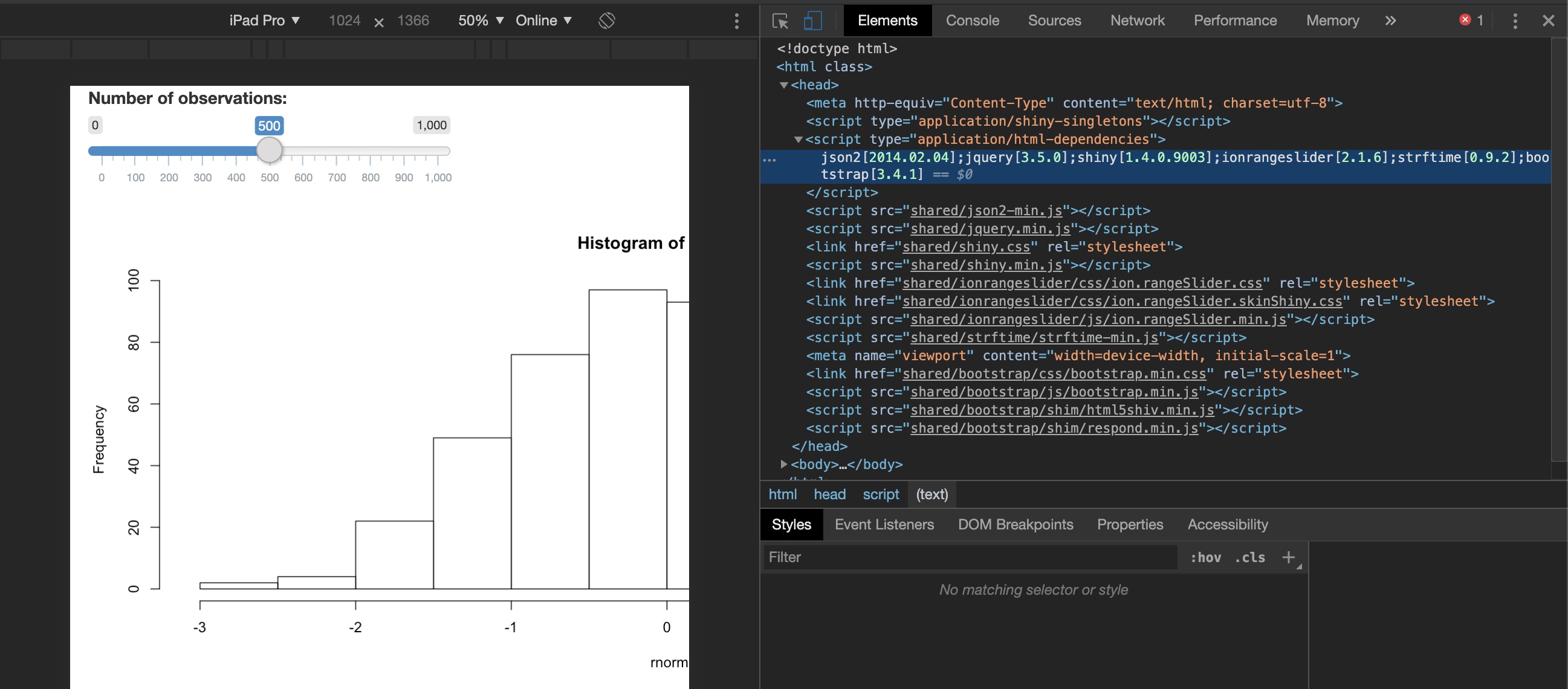
FIGURE 19.6: Inspect slider input dependencies.
Even stranger, when we use renderUI() to conditionally render the slider, the dependency is only included when the go button is pressed. How does Shiny include them?
### RUN ###
# OSUICode::run_example(
#  "tabler/renderUI",
#   package = "OSUICode"
# )

### APP CODE ###
library(shiny)

ui <- fluidPage(
  actionButton("go", "Go!", class = "btn-success"),
  uiOutput("slider"),
  plotOutput("distPlot")
)

# Server logic
server <- function(input, output) {

  output$slider <- renderUI({
    req(input$go > 0)
    sliderInput(
      "obs",
      "Number of observations:",
      min = 0,
      max = 1000,
      value = 500
    )
  })

  output$distPlot <- renderPlot({
    req(input$obs)
    hist(rnorm(input$obs))
  })
}

# Complete app with UI and server components
shinyApp(ui, server)
Let’s look at renderUI():
renderUI <- function (
  expr,
  env = parent.frame(),
  quoted = FALSE,
  outputArgs = list()
) {
  installExprFunction(expr, "func", env, quoted)
  createRenderFunction(func, function(result, shinysession,
                                      name, ...) {
    if (is.null(result) || length(result) == 0)
      return(NULL)
    processDeps(result, shinysession)
  }, uiOutput, outputArgs)
}
The last line returned is processDeps(result, shinysession). As stated in section 15.3, this function is responsible to handle dependencies during run time. shiny:::processDeps (R side) works with Shiny.renderContent (JS side), as already mentioned in part 15.3. The latter takes a tag element as well as an object containing its HTML code and dependencies, for instance:
exports.renderContent($tag[0], {
  html: $tag.html(),
  deps: message.tag.deps
});
Note that, as it is bad practice to rely on other packages’s internal functions, we’ll rely on htmltools::renderTags instead of shiny:::processDeps, being very similar.
In the following, we modify the insert_tabler_tab() to include the dependencies processing step. This actually requires changing only three lines of code (the last one consists of pointing to the new JS handler):
insert_tabler_tab_2 <- function(
  inputId,
  tab,
  target,
  position = c("before", "after"),
  select = FALSE,
  session = getDefaultReactiveDomain()
) {

  # ... Unchanged

  content <- htmltools::renderTags(tab),
  link <- htmltools::renderTags(navbar_menu_item),

  session$sendCustomMessage("insert-tab-2", message)
}
We then apply the Shiny.renderContent method to the tab content and navigation item. Below, we only show what changed compared to the first handler defined earlier:
$(function() {
  Shiny.addCustomMessageHandler('insert-tab-2',
    function(message) {
    // message.content and message.link are objects
    // with 2 fields: html (tag) and deps (dependencies)
    // We only need HTML for now.
    let $divTag = $(message.content.html);
    let $liTag = $(message.link.html);

    // Unchanged

    // Render input/output in newly added tab.
    // It takes the possible deps and add them to the tag.
    Shiny.renderContent(
      $liTag[0],
      {html: $liTag.html(), deps: message.link.dependencies}
    );
    Shiny.renderContent(
      $divTag[0],
      {html: $divTag.html(), deps: message.content.dependencies}
    );

    // Trigger show: unchanged
  });
});
We check if our approach works as expected.
### RUN ###
# OSUICode::run_example(
#  "tabler/insert-tab-2",
#   package = "OSUICode"
# ) 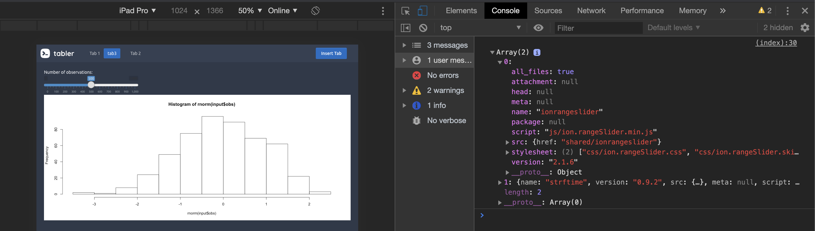
FIGURE 19.7: htmltools::renderTags and Shiny.renderContent in action.
Et voila! As shown in Figure 19.7, everything is properly displayed.
19.4.2 Exercise
Taking inspiration from the insert_tabler_tab() function, write the remove_tabler_tab() function.