18 Develop custom input widgets

In the previous chapter, we built template dependencies, the page skeleton, as well as containers like cards. Now is a great time to integrate new inputs, leveraging all knowledge from Chapter 12.

18.1 Tabler action button

Let’s start with a simple input: the action button. Tabler has built-in HTML buttons with a substantial amount of custom styles, compared to the classic Shiny action button.

18.1.1 Reminders about the action button

Below is the actionButton() code:

actionButton <- function (inputId, label, icon = NULL, 
                          width = NULL, ...)  {
  value <- restoreInput(id = inputId, default = NULL)
  tags$button(
    id = inputId, 
    style = if (!is.null(width)) {
      paste0("width: ", validateCssUnit(width), ";")
    }, 
    type = "button", 
    class = "btn btn-default action-button", 
    `data-val` = value, 
    list(validateIcon(icon), label), ...
  )
}

The button tag has some attributes like id, style, type, class, data-val, label and children passed via ....

When the app starts, the action button has the value 0, and each click increments its value by 1. How is this behavior controlled? If you recall, it is due to the input binding file, specifically the one for the action button:

var actionButtonInputBinding = new InputBinding();
$.extend(actionButtonInputBinding, {
  find: function(scope) {
    return $(scope).find('.action-button');
  },
  getValue: function(el) {
    return $(el).data('val') || 0;
  },
  // ....; Extra code removed
});

What you see above is not the whole script since we focus on the first method, that is find. It will look for all elements having the class action-button, making it possible to define multiple action buttons at the same time.

Consequently, if we go back to the previous section, the actionButton() has the class action-button, thereby making it visible to the binding. Interestingly, all elements having the class action-button will be considered by the same shiny input binding.

18.1.2 Application to Tabler

First of all, let’s compare the tabler HTML button to the Shiny action button.

<button class="btn btn-primary">Button</button>

We convert it to R code. The button API contains more style and we leave the reader to add extra elements as an exercise.

tabler_button <- function(inputId, label, status = NULL, 
                          icon = NULL, width = NULL, ...) {
  # SEE BELOW
  }

In Tabler, the button status is mandatory, which is the reason why it is a function parameter. We assume that by default, the button has a blue color, which is given by btn-primary:

btn_cl <- paste0(
  "btn action-button",
  if (is.null(status)) {
    " btn-primary"
  } else {
    paste0(" btn-", status)
  }
)

Moreover, we add an horizontal right margin to the icon, if provided so that the label renders well (mr-1, where m stands for margin, r is the right direction and 1 is the margin value).

# custom right margin
if (!is.null(icon)) icon$attribs$class <- paste0(
  icon$attribs$class, " mr-1"
)

The button tag is identical to that of Shiny, which is the reason why we don’t show it here. The whole code may be found here.

### RUN ### 
# OSUICode::run_example( 
#  "tabler/button", 
#   package = "OSUICode" 
# ) 

### APP CODE ### 
library(shiny)
library(OSUICode)

ui <- tabler_page(
  tabler_body(
    tabler_button(
      "btn",
      textOutput("val"),
      icon = icon("thumbs-up"),
      width = "25%"
    )
  )
)

server <- function(input, output, session) {
  output$val <- renderText({
    paste("Value:", input$btn)
  })
}

shinyApp(ui, server)

We easily check that clicking on the button increments the related input. Thus, one may see how easy it is to implement a Tabler input button, built on top of the Shiny action button. The output is shown in Figure 18.1.

Tabler action button.

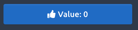
FIGURE 18.1: Tabler action button.

As a general rule, don’t try to reinvent the wheel and see whether any existing Shiny element may be used instead.

18.2 Toggle Switch

We implement the toggle switch component. The HTML structure may be inspected here (or in demo/form-elements.html if you already downloaded the repository locally).

<label class="form-check form-switch">
  <input class="form-check-input" type="checkbox" checked>
  <span class="form-check-label">Option 1</span>
</label>

Notice that the tabler switch has the checkbox type, which is very similar to the Shiny checkbox (a switch being a checkbox with a different style):

checkboxInput("test", "Test", TRUE)
#> <div class="form-group shiny-input-container">
#>   <div class="checkbox">
#>     <label>
#>       <input id="test" type="checkbox" checked="checked"/>
#>       <span>Test</span>
#>     </label>
#>   </div>
#> </div>

Therefore, we should again be able to build on top of an existing input binding. We create the tabler_switch() function.

tabler_switch <- function(inputId, label, value = FALSE, 
                          width = NULL) {
  # SEE BELOW
  }

We start to recover any possible bookmarked value with restoreInput():

value <- restoreInput(id = inputId, default = value)

Then, in line with the above HTML structure, we design the input tag. If we want to reuse the shiny::checkboxInput() binding, we must not forget the type = checkbox:

$.extend(checkboxInputBinding, {
  find: function(scope) {
    return $(scope).find('input[type="checkbox"]');
  }
  // other methods
});
input_tag <- tags$input(
  id = inputId, 
  type = "checkbox",
  class = "form-check-input"
)

We conditionally add a checked attribute depending on the current value parameter:

if (!is.null(value) && value) {
  input_tag <- tagAppendAttributes(
    input_tag, 
    checked = "checked"
  )
}

We proceed to the main wrapper creation, which has a label tag having the form-check form-switch class, as well as an optional width parameter:

input_wrapper <- tags$label(
  class = "form-check form-switch", 
  style = if (!is.null(width)) {
    paste0("width: ", validateCssUnit(width), ";")
  }
)

We finally put everything together with tagAppendChildren(), the whole code being accessible here:

  tagAppendChildren(
    input_wrapper,
    input_tag,
    span(class = "form-check-label", label)
  )

Besides, we may also create an update_tabler_switch() function similar to the updateCheckboxInput(). We leverage OSUICode::dropNulls(), a function that removes all NULL elements from a list. If you remember, the session$sendInputMessage from R is received by the receiveMessage method on the JavaScript side:

update_tabler_switch <- function (session, inputId, 
                                  label = NULL, 
                                  value = NULL) {
  message <- dropNulls(list(label = label, value = value))
  session$sendInputMessage(inputId, message)
}

In the following example, the action button toggles the switch input value when clicked, as shown in Figure 18.2.

### RUN ### 
# OSUICode::run_example( 
#  "tabler/switch", 
#   package = "OSUICode" 
# ) 

### APP CODE ### 
library(shiny)
library(OSUICode)

ui <- tabler_page(
  tabler_body(
    fluidRow(
      tabler_button(
        "update",
        "Go!",
        width = "25%",
        class = "mr-2"
      ),
      tabler_switch(
        "toggle",
        "Switch",
        value = TRUE,
        width = "25%"
      )
    )
  )
)

server <- function(input, output, session) {
  observe(print(input$toggle))
  observeEvent(input$update, {
    update_tabler_switch(
      session,
      "toggle",
      value = !input$toggle
    )
  })
}

shinyApp(ui, server)
Tabler action button updating a toggle input.

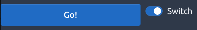
FIGURE 18.2: Tabler action button updating a toggle input.

Et voilà! Two inputs in just a few minutes.

18.3 Navbar menu input

As stated in Chapter 12, it is quite straightforward to bind elements other than primary inputs (HTML elements with the input tag) to Shiny. As a reminder, we created a custom input binding to detect the state of a shinydashboard box. In Chapter 17, we designed the tabler_navbar(), as well as the tabler_navbar_menu() and tabler_navbar_menu_item(). As in shinydashboard, it would be great to capture the currently selected tab to subsequently perform actions on the server side, updating the selected tab based on a button click.

Where do we start? First of all, we add an id attribute to the tabler_navbar_menu() so that it holds the corresponding input$id. Whether to use inputId or id as a parameter name is up to you, id being personally prefered in that case:

tabler_navbar_menu <- function(..., inputId = NULL) {
  tags$ul(
    id = inputId, 
    class = "nav nav-pills navbar-nav",
    ...
  )
}

The next step is the JS navbarMenuBinding creation. We decide to look for the navbar-nav class in the find method. Below, we describe the binding step by step. You may find the whole working code at the end of this example:

find: function(scope) {
  return $(scope).find('.navbar-nav');
}

In the initialize method, we ensure that if no tab is selected at start, the first tab will be selected by default. Otherwise, we select the activated tab. We use the template literals to ease the insertion of JS code in strings (${menuId} .nav-link.active):

initialize: function(el) {
  let menuId = '#' + $(el).attr('id');
  let activeTab = $(`${menuId} .nav-link.active`);
  // if multiple items are found
  if (activeTab.length > 0) {
    let tabId = $(activeTab).attr('data-value');
    $(activeTab).tab('show');
    $(`#${tabId}`).addClass('show active');
  } else {
    $(`${menuId} .nav-link`)
      .first()
      .tab('show');
  }
}

The role of getValue is to return the currently selected tab. As a reminder, here is the tabler_navbar_menu_item() function:

tabler_navbar_menu_item <- function(text, tabName, 
                                    icon = NULL, 
                                    selected = FALSE) {
  
  item_cl <- paste0("nav-link", if(selected) " active")
  
  tags$li(
    class = "nav-item",
    a(
      class = item_cl,
      `data-value` = tabName,
      # Commented since not relevant
    )
  )
}

From that function, the active item has is the a element with the classes nav-link active. We recover the tab value stored in the data-value attribute. A bit of jQuery does the trick:

getValue: function(el) {
  let activeTab = $(el).find('a').filter('nav-link active');
  return $(activeTab).attr('data-value');
}

setValue is the function allowing to update the active tab. Bootstrap 4 already has predefined methods to activate tabs. The easiest way is to select the tab by name like $('#tabMenu a[data-target="#tab1"]').tab('show'). The receiveMessage is simply applying the setValue method:

setValue: function(el, value) {
  let hrefVal = '#' + value;
  let menuId = $(el).attr('id');
  $(`#${menuId} a[data-target="${hrefVal}"]`).tab('show');
}

receiveMessage: function(el, data) {
  this.setValue(el, data);
}

Besides, we have to create the update_tabler_tab_item() function:

update_tabler_tab_item <- function(
  inputId, 
  value, 
  session = getDefaultReactiveDomain()
) {
  session$sendInputMessage(inputId, message = value)
}

subscribe tells Shiny when to change the current input value and made it available in the whole app. We may listen to multiple events, keeping in mind that events occur in the following order:

  • hide.bs.tab (on the current active tab).
  • show.bs.tab (on the to-be-shown tab).
  • hidden.bs.tab (on the previous active tab, the same one as for the hide.bs.tab event).
  • shown.bs.tab (on the newly-active just-shown tab, the same one as for the show.bs.tab event).

Hence, it makes more sense to listen to shown.bs.tab, that is wait for the current tab to be shown:

subscribe: function(el, callback) {
  // important to use shown.bs.tab and not show.bs.tab!
  $(el).on('shown.bs.tab.navbarMenuBinding', function(e) {
    callback();
  });
},
  
unsubscribe: function(el) {
  $(el).off('.navbarMenuBinding');
}

The whole binding code is located here.

How do we include this custom input binding in our package? In {OSUICode}, we created the following HTML dependency:

tabler_custom_js <- htmlDependency(
  name = "tabler-bindings",
  version = "1.0.7",
  src = "tabler",
  package = "OSUICode",
  script = "input-bindings/navbarMenuBinding.js"
)

We also updated the add_tabler_deps, as below.

add_tabler_deps <- function(tag) {
  # below, the order is of critical importance!
  deps <- list(bs4_deps, tablers_deps, tabler_custom_js)
  attachDependencies(tag, deps, append = TRUE)
}

We test the new navbar_menu() binding below.

### RUN ### 
# OSUICode::run_example( 
#  "tabler/update-navbar", 
#   package = "OSUICode" 
# ) 

Here we are!

18.4 Exercises

  1. Have a look at the Tabler documentation about buttons and extend the tabler_button function accordingly.
  2. Propose an implementation of the Advanced selectboxes shown here and Figure 18.3.
Advanced select input with user image.

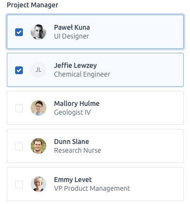
FIGURE 18.3: Advanced select input with user image.

  1. Cards are central elements of all templates. So are tabset panels. Try to modify the tabler_card() function to create a tabler_tab_card() function, adding tab navigation within the card header.